Metered Article


Timeline
10 weeks
Role
UX/UI design
Research
Visual design
Prototyping
Team
Senior director of product
Senior product manager
Product manager
Executive director of engineering
Executive director of product
Project manager
Hypothesis
We know that exclusive news is a main reason subscribers use the platform. We believe that preview access to exclusive news for non-subscribers will result in an increase in new subscribers.
Test
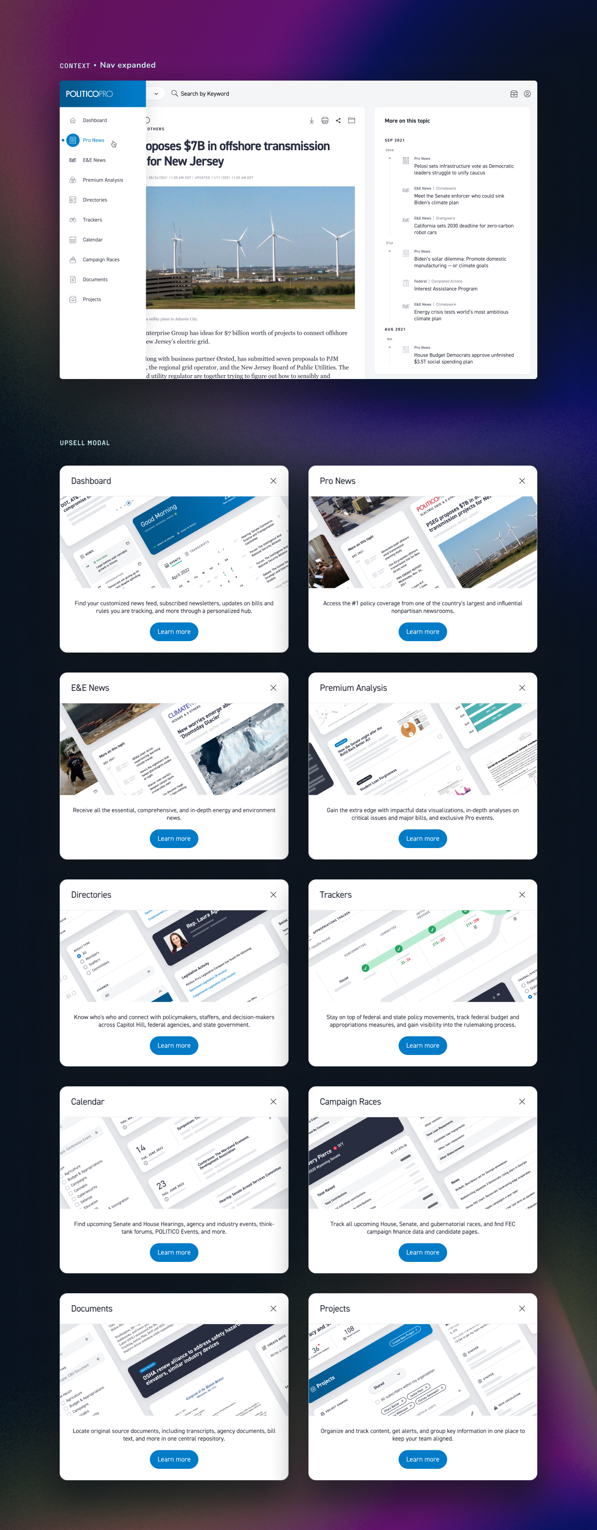
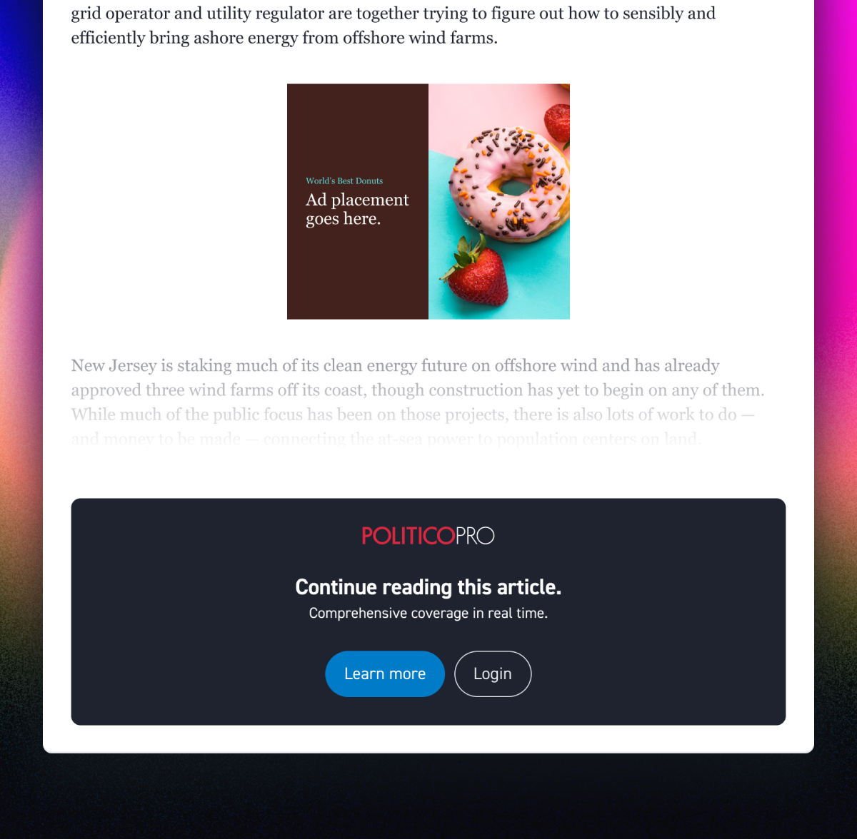
A non-subscriber accesses a news article page in a partial-view mode. They cannot navigate anywhere else on the platform, but they can learn more about each feature.
Politico Pro is a policy platform built to meet the needs of policy analysts, researchers, lobbyists, and consultants. The exclusive news is a main reason why subscribers choose the platform. I led design in a growth experiment by leveraging this to acquire new subscribers.
Information architecture
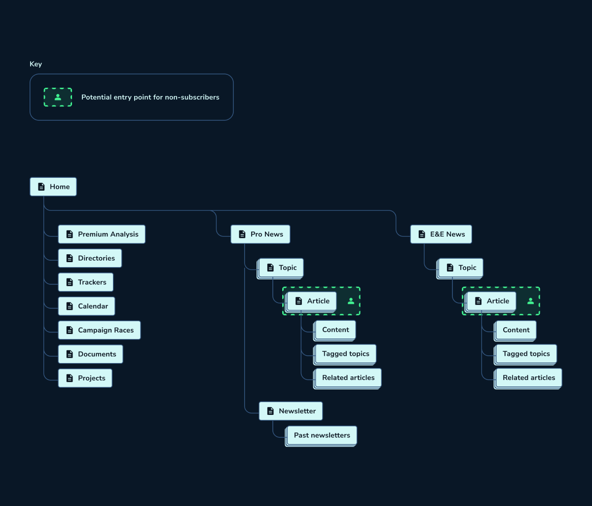
I looked at the current structure to understand exclusive news on the platform. The three main sections are Pro News, E&E News (acquired by Politico), and Newsletter.
I also identified the potential entry point for non-subscribers.
System model
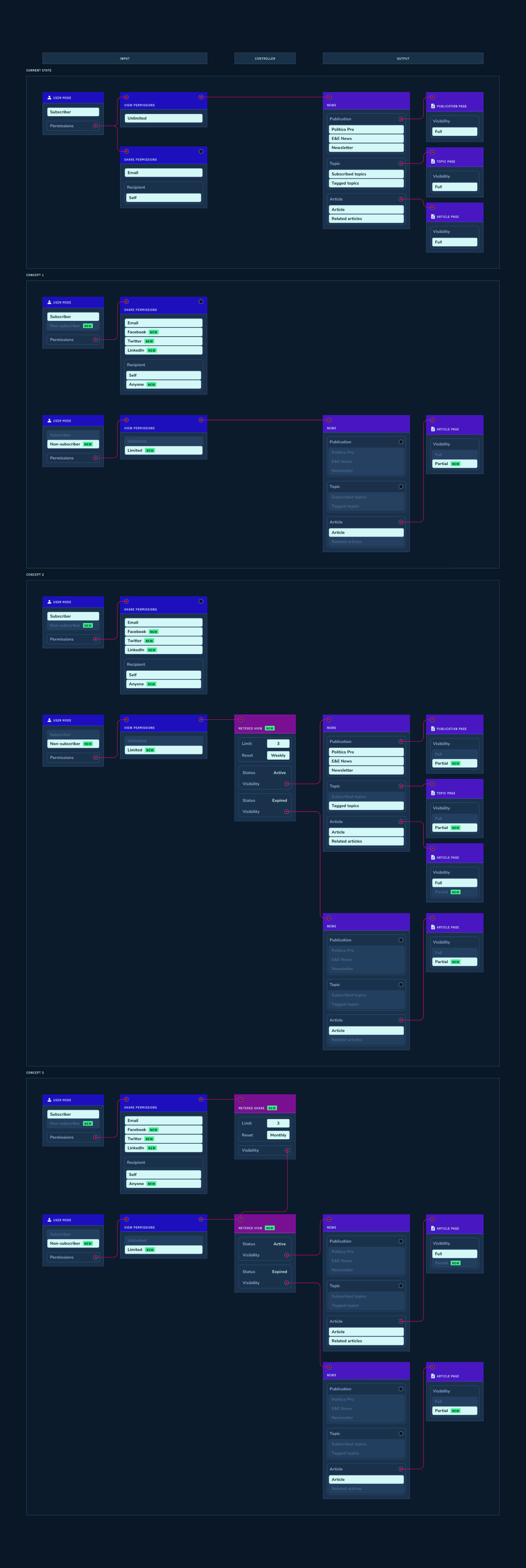
I mapped out different properties such as user actions, system inputs, and content. This helped us to visualize the test and which properties we might tweak.
I created three different concepts that we might use for testing. I also visualized the current state to use as a reference as we were designing the experience for a new type of user: the non-subscriber.
Original
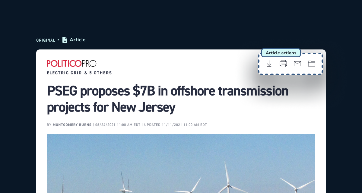
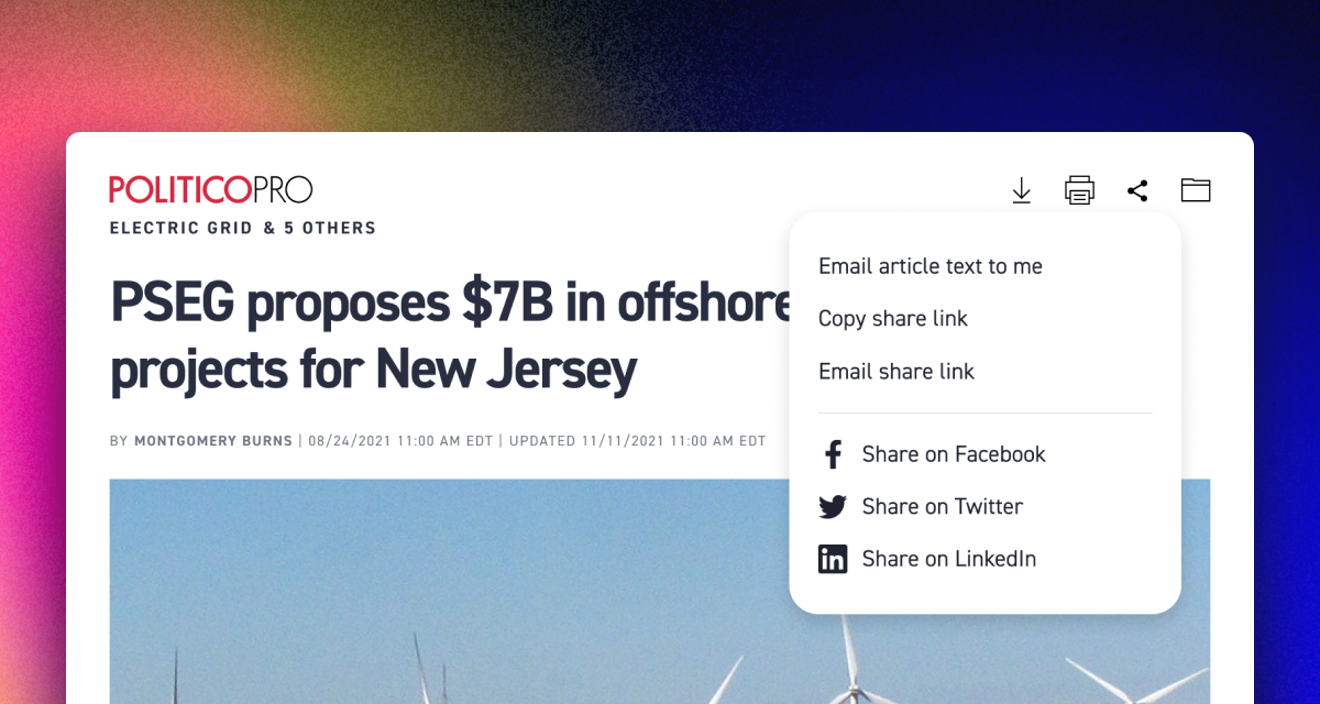
The article page has four actions. Originally, one of them sends the subscriber the article text to their email.
I looked at this as an opportunity to build upon existing user actions.
Concepts
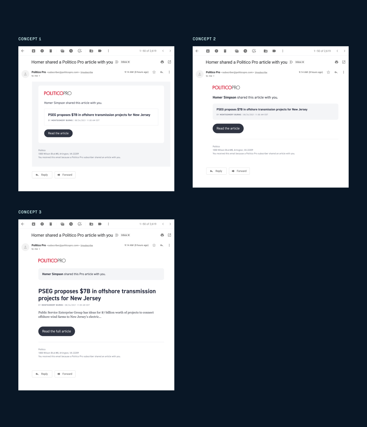
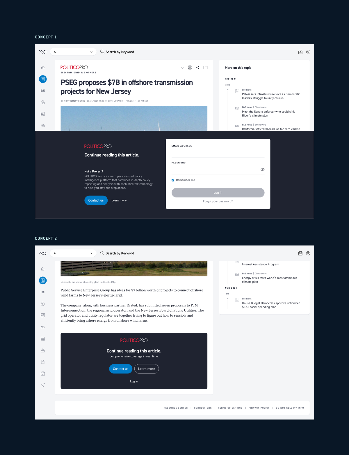
I shared concepts for a share pop-up menu, share modal, email notification, and a partial-view mode of the article page.
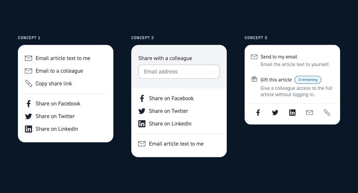
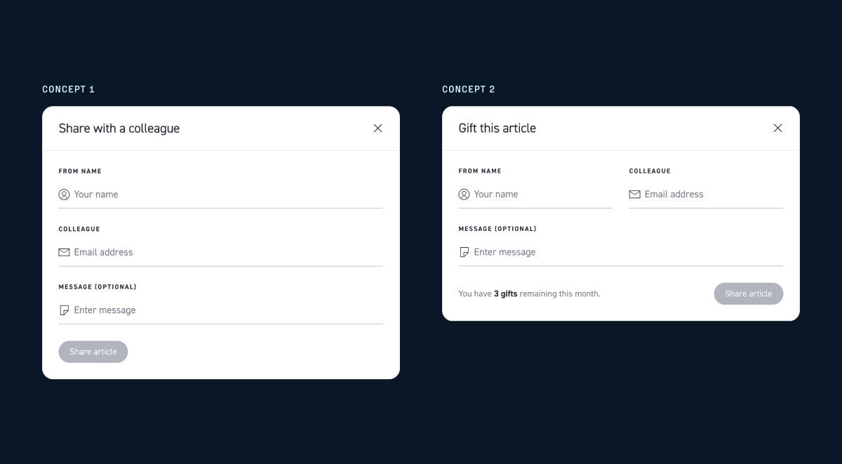
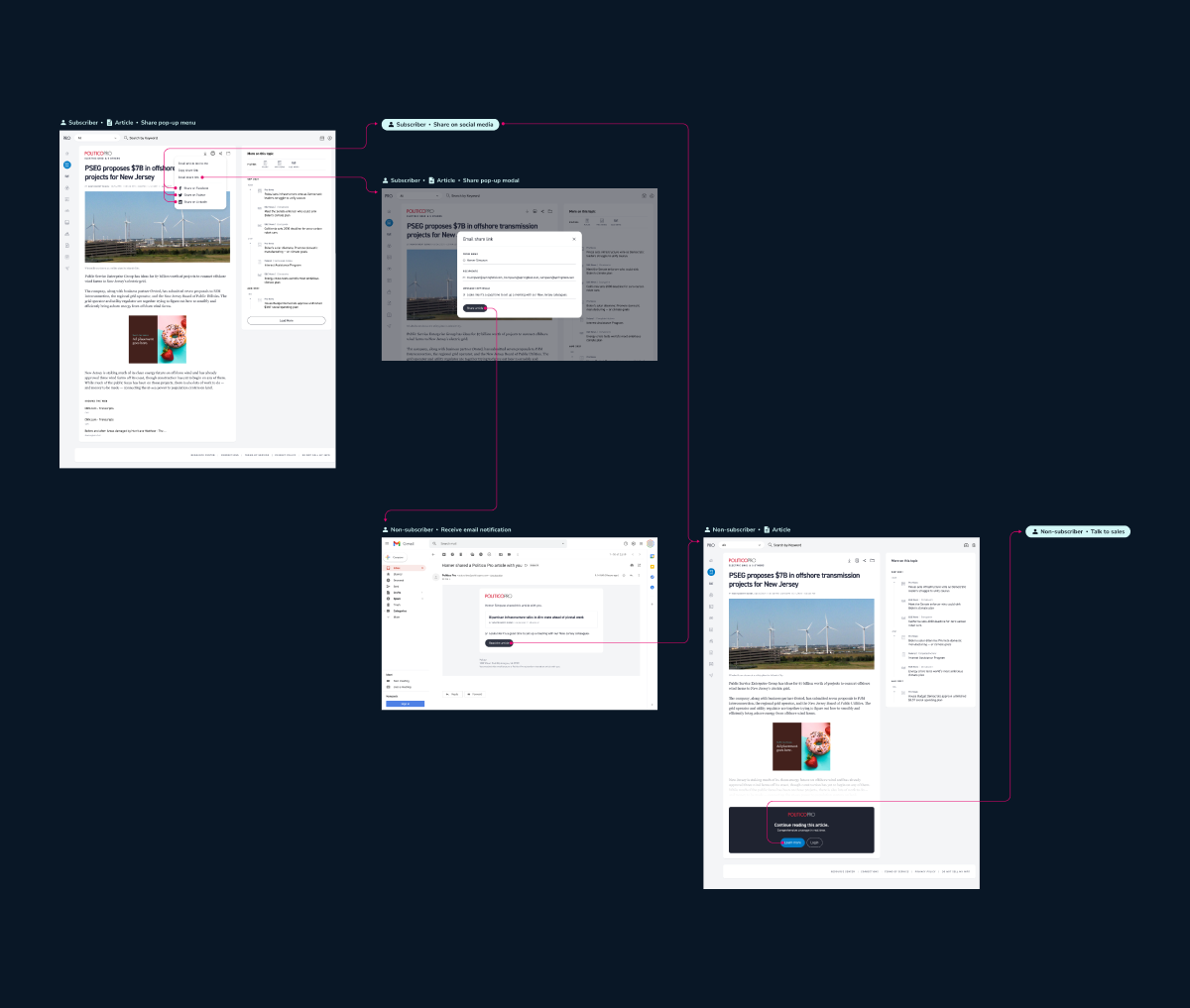
The original user action (send article text to the subscriber's email) is the first item in the share pop-up menu. I wanted to reduce any possible frustrations with users adjusting to this UI update.
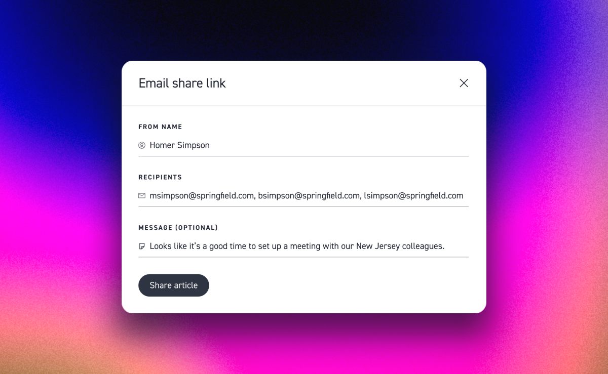
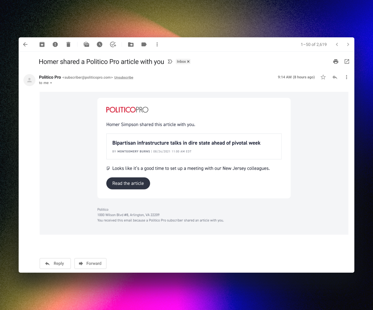
The content in the email is kept to a minimum to quickly direct the non-subscriber recipient to the article page. The optional message also appears right before the primary button.
As a baseline test, we decided to not place any metered limits on visits by non-subscribers. Instead, we decided to place the limit on the viewable content. I worked with the Senior Director of Product to determine the viewable content limit.
Although non-subscribers have limited access inside the platform, it is still an opportunity for them to get a feel of the product. We built on this opportunity as a moment for them to learn about each feature. I also designed the images for each upsell modal variant.
