Virtual Sessions

Launched
2020-05
Timeline
1 month
Role
UX/UI Design
Research
Prototyping
Team
Web project manager
Brand design manager
Events manager
Communications manager
Demand generation manager
Event coordinator
Marketing operations analysist
Front-end developer
Problem
After the event is over, attendees don't have a way to access all recorded content.
Goal
Extend the lifecycle of the Collaborative by launching a hub of all recorded content.
Outcome
28% of attendees returned to engage with post-event content.
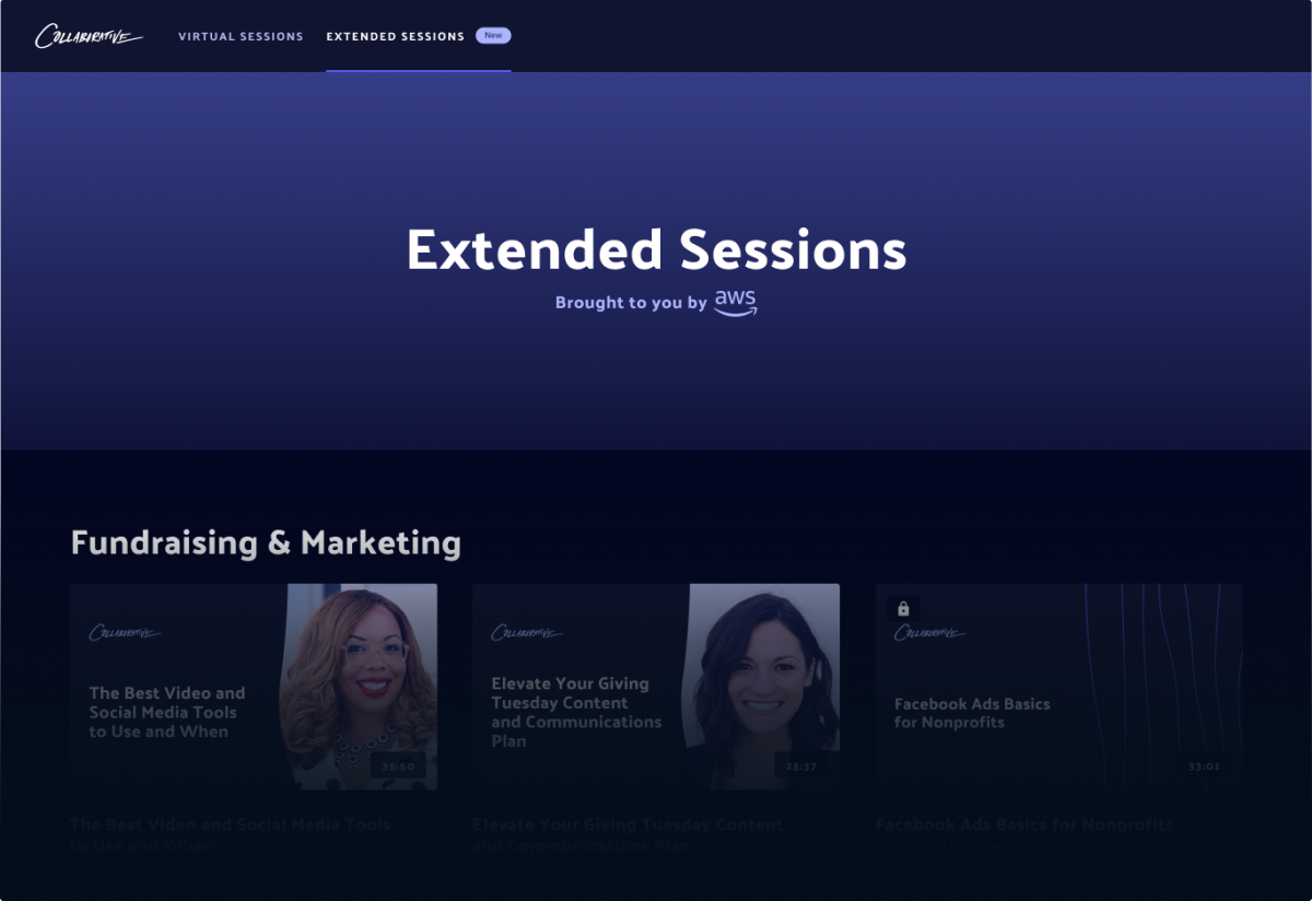
The Collaborative is a conference for nonprofit professionals. Due to the pandemic, the in-person annual event was cancelled. The event organizers quickly shifted to re-launching the conference as a virtual event. In less than a month, I helped the team launch a web experience where attendees could watch recordings of the talks. Attendees could also access exclusive bonus content that were made available post-event.
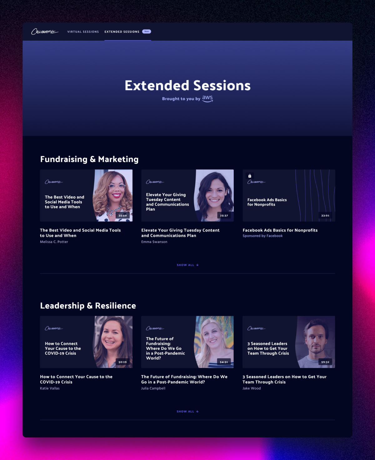
I added a "new" badge to the Extended Sessions tab. This indicates to the attendee that every video listed under this tab is new bonus content. Instead of adding this badge to each video, we were able to reduce the cognitive load for the attendee as they browsed through the gallery.
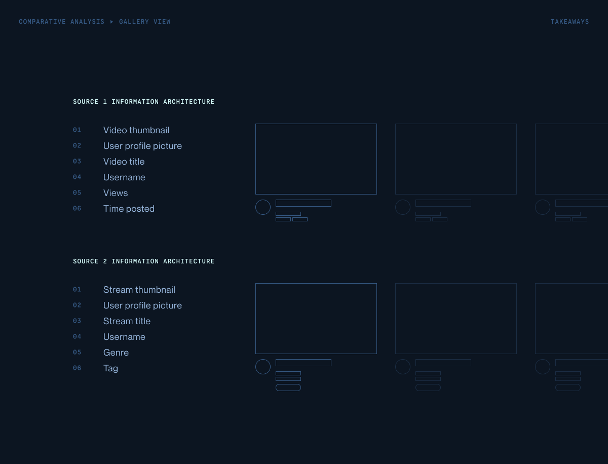
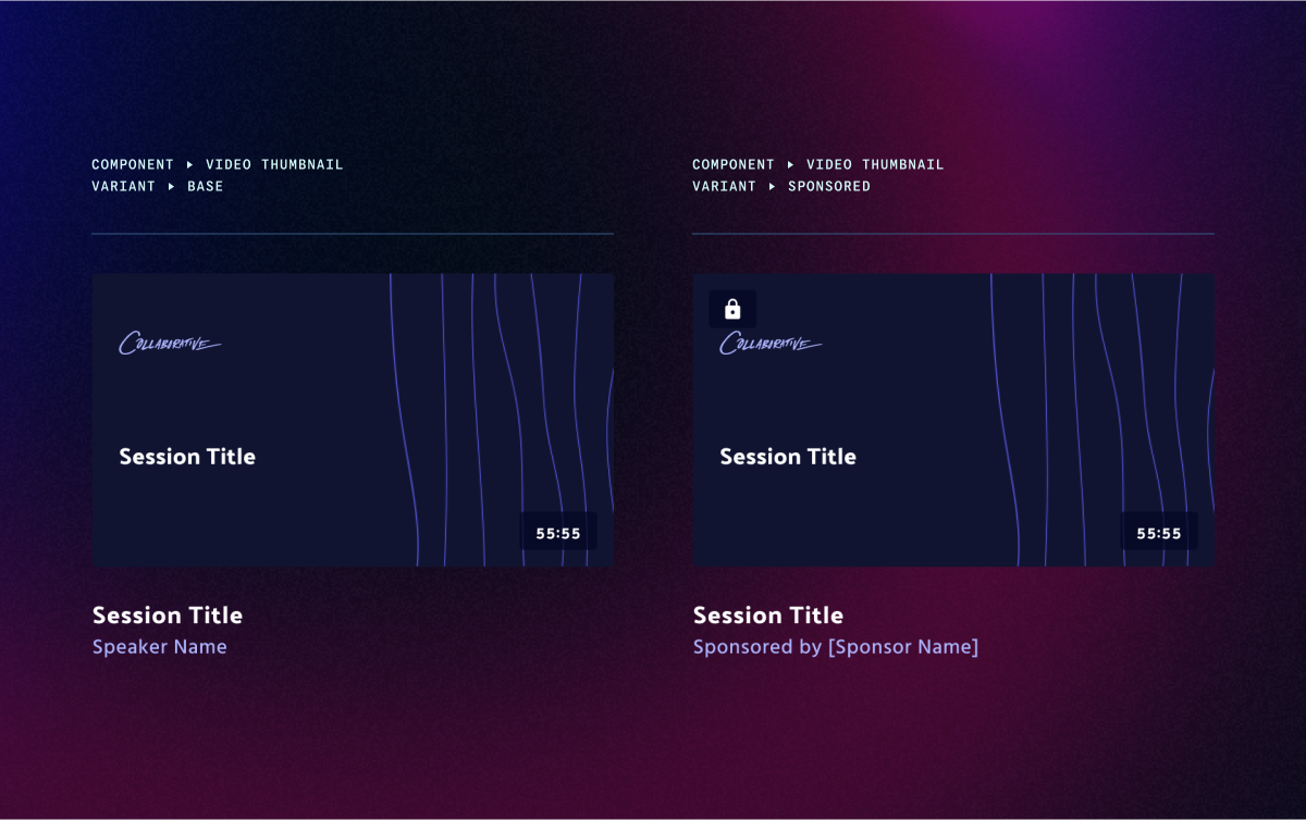
I created a "base" variant for the video thumbnail component. This enabled me to work efficiently within the project's quick turnaround delivery.
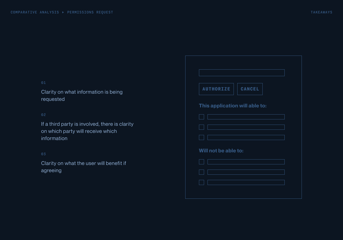
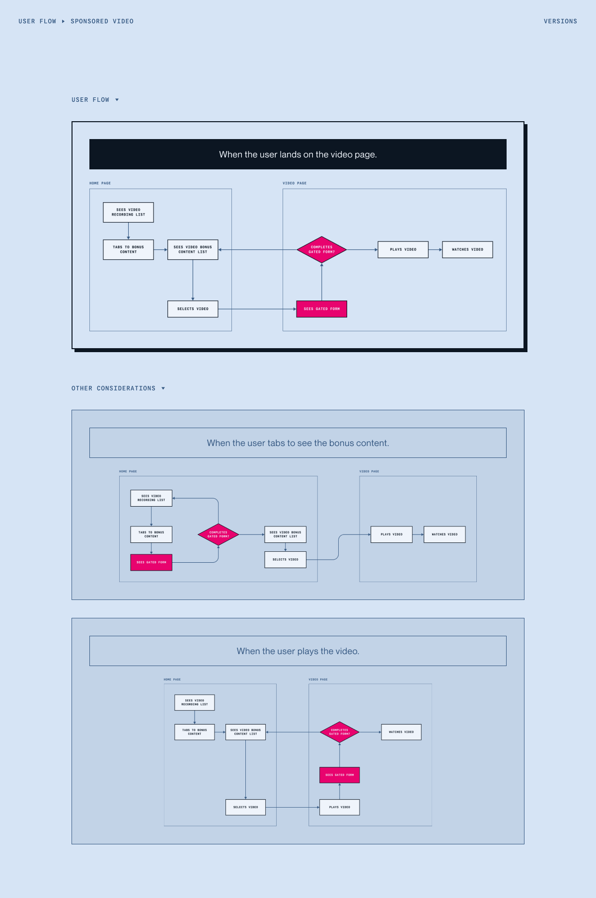
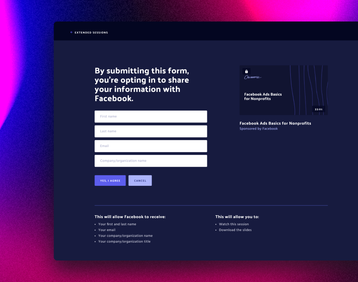
The "sponsored" variant replaces the speaker name with the sponsor name and adds a "lock" icon. Because a gated form adds friction to the user experience, I wanted to mitigate that by using the "lock" icon to signal that extra step in the user flow.
Applying my key research takeaways from permissions request screens, I aimed to show full transparency with the information the attendee decides to share. This meant displaying exactly the who (sponsor name) and the what (information).
This is a big moment in the user experience where attendees might drop-off. I added incentives to help encourage them to continue. This meant displaying what the attendee will benefit from completing this form.
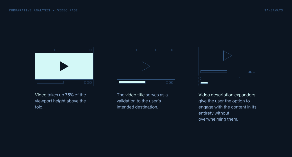
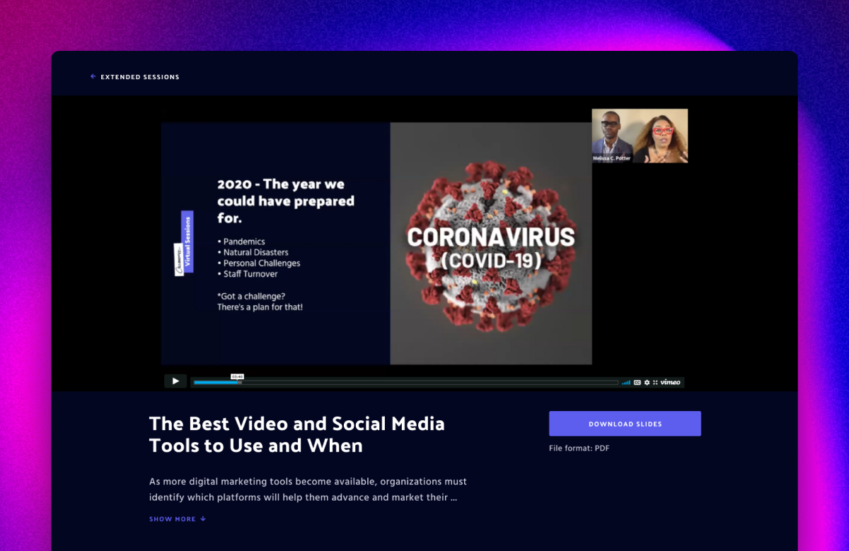
I focused on matching the visual hierarchy with the attendee's primary goal from the very beginning of the user flow: to watch a video. I designed for the video to occupy about 75% of the viewport height above the fold. This allowed the "download slides" button to also be visible above the fold.
Then I looked at how simplifying some of the other content on the page would help bring focus to the video. I used an expander to hide the session description if it were to exceed two lines. Many of these descriptions were very lengthy and could have taken attention away from the video. I also simplified the nav to one simple action instead of three.
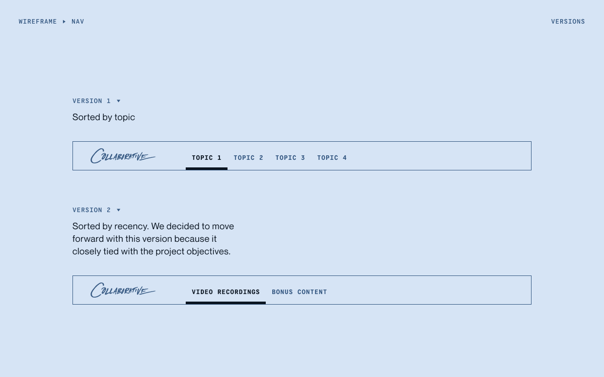
This is one of my favorite and most memorable projects to date. I originally presented a wireframe of this design to the team right when we made the decision to pivot into a virtual event. This was intended for our live experience. However, the team decided to move forward with other avenues.
Even though we had to scrap the concept, I still had an itch to see this come to life. Out of my own volition, I added in the visual layers and created the high fidelity prototype. It was a fulfilling moment for me even though I knew we couldn't use it. Or so I thought...
A week later, the team kicked off this project for post-event. Serendipitously, I saw that the design that I had for the live experience could still apply to this post-event experience.
I look back at this experience to remind myself to follow my heart. Sometimes a design solution might not have a place in that moment due to other factors outside of my reach. What was important for me was to keep that passion that I had to solve for this exciting challenge.