Multi-Sided Merch

Launched
2022-06
Timeline
6 weeks
Role
UX/UI design
Research
Prototyping
Team
Product manager
Engineering manager
Front-end developer
Problem
Content creators are limited to designing on one predefined side of a merch item.
Goal
Improve merch creation with the ability to design on multiple sides.
Outcome
Increased percentage of merch stores that reactivated.
StreamElements is the leading provider of engagement and monetization tools for content creators. The merch product allows creators to design their own merch and customize their storefront. I led the end-to-end design process for the new multi-sided feature across all areas of the merch product: dashboard, editor, and storefront.
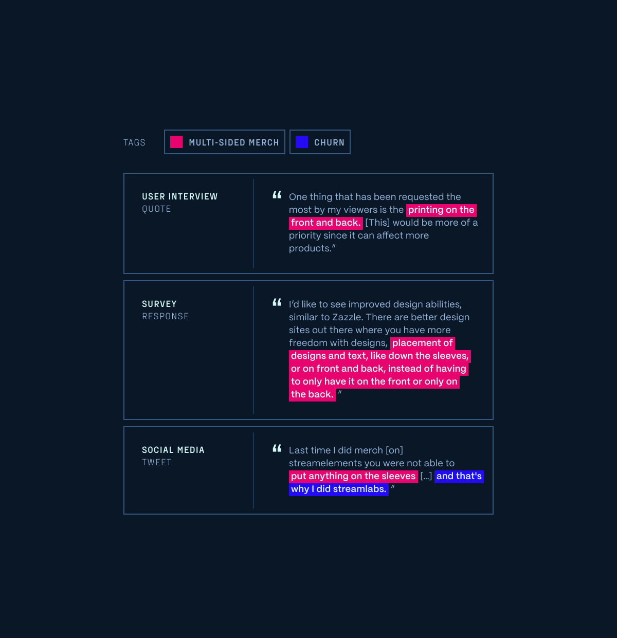
Qualitative analysis
Through interviews, surveys, and social media, we learned from creators the desire to design on multiple sides of a merch product. We also realized its severity since we found evidence of churn.
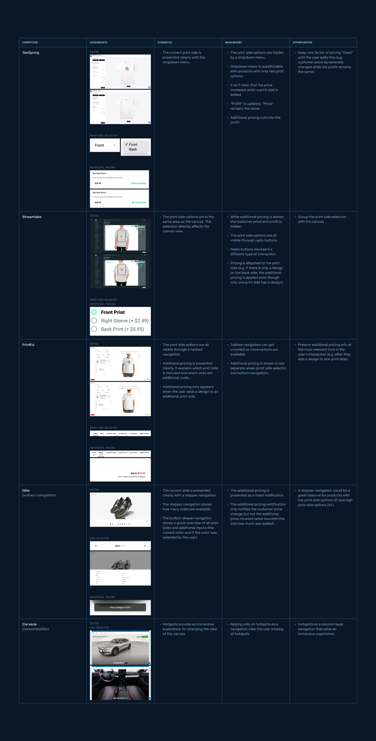
Competitive analysis
I analyzed the strengths, weaknesses, and opportunities from our direct competitors.
I also looked outside of the merch creation space (sneakers, cars, etc.) to understand how different products in different spaces are approaching a similar problem.
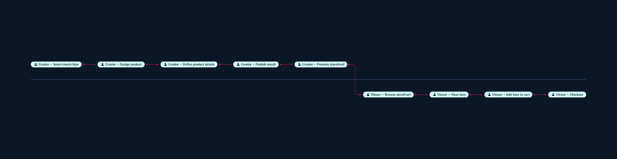
Journey map
I mapped out the high-level stages to understand the scope of the project.
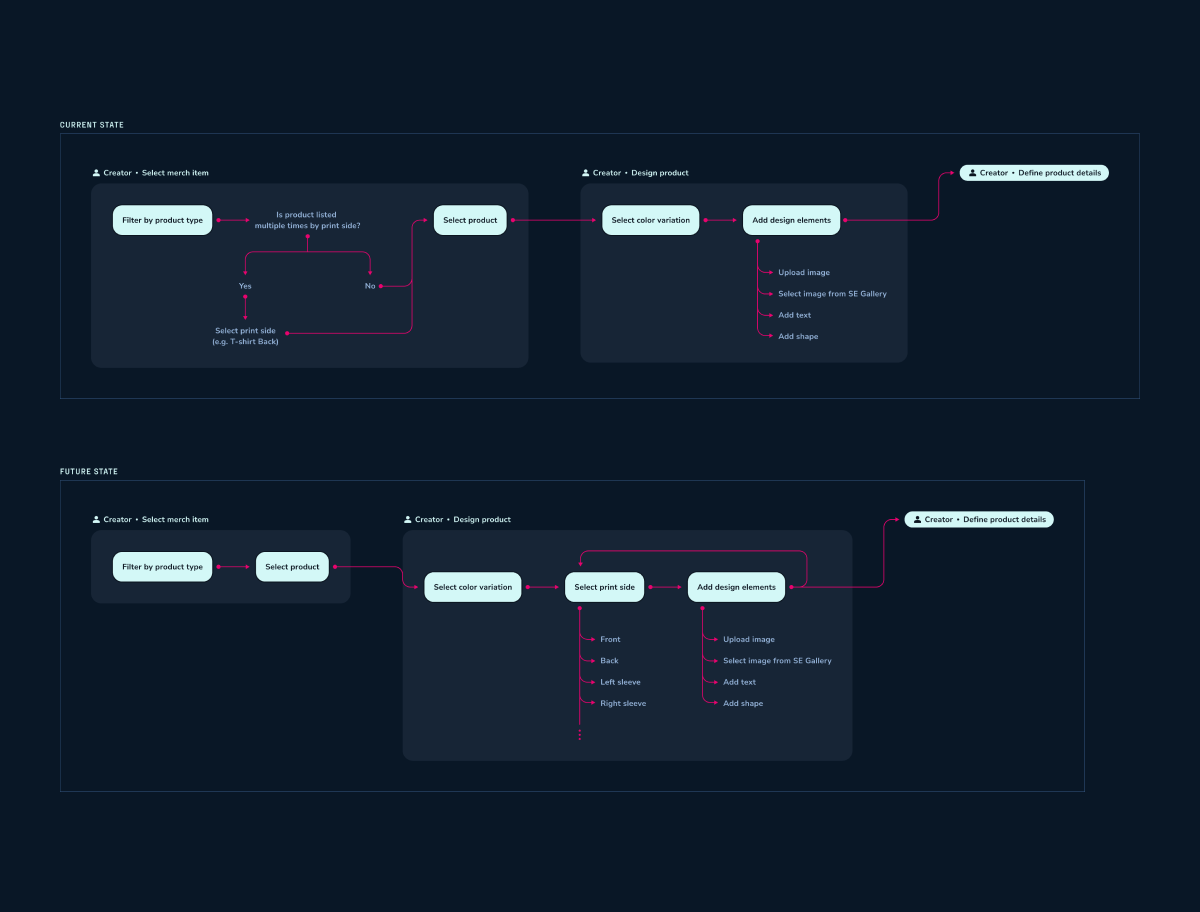
User flow
Looking at the current state of the user flow, I realized that the decision point to select a print side occured much earlier in the process.
For the future state, I moved that decision point to a more relevant part of the merch design process.
Information architecture
Knowing where to focus on in the user flow, I knew the specific screens to look at. Then I identified potential areas where I could focus on for designing concepts.
This was also my first project with my team. Creating the information architecture helped me to gain a more in-depth familiarity with the merch product as I began to understand the relationships between contents.

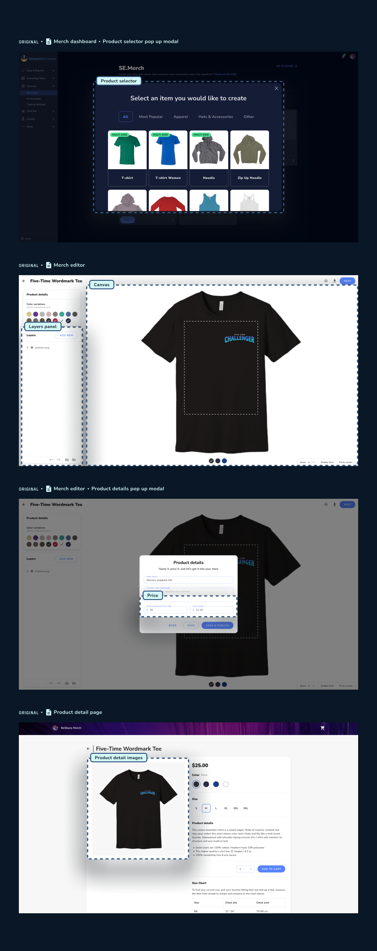
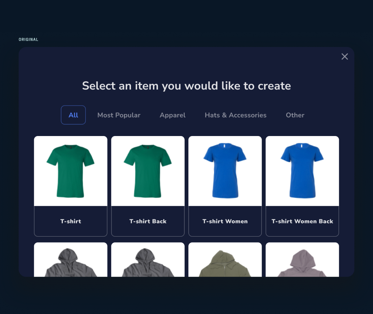
Original
Looking at the screens for the current user flow, I identified potentially affected areas in the UI. Knowing the specific screens also allowed me to better understand the project scope.
Concepts
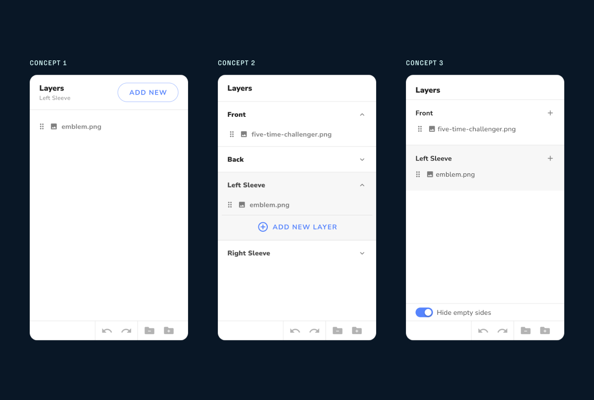
The potentially affected areas I identified from the information architecture allowed me to focus on specific UI components.
I shared three early sketches with my team. I created a "low lift" approach while another was an "aspirational" approach. This helped us to decide on a direction to move forward with and reiterate on.
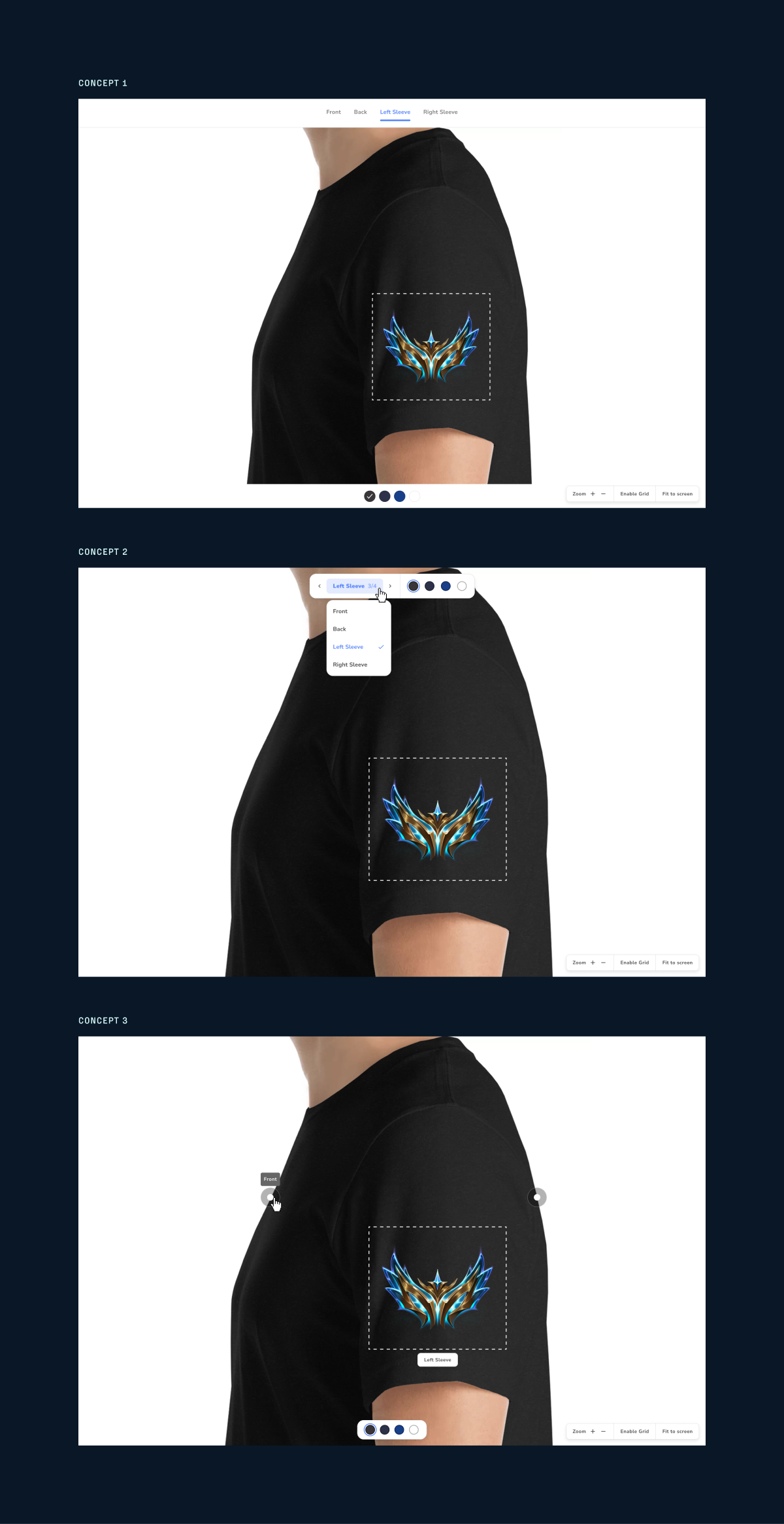
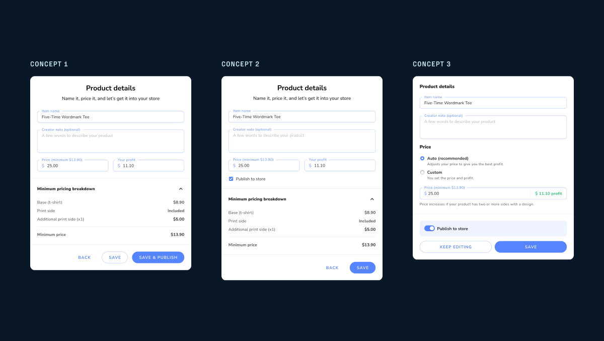
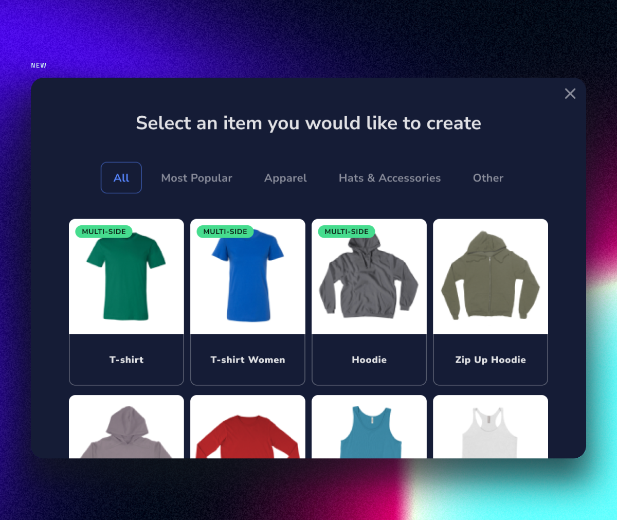
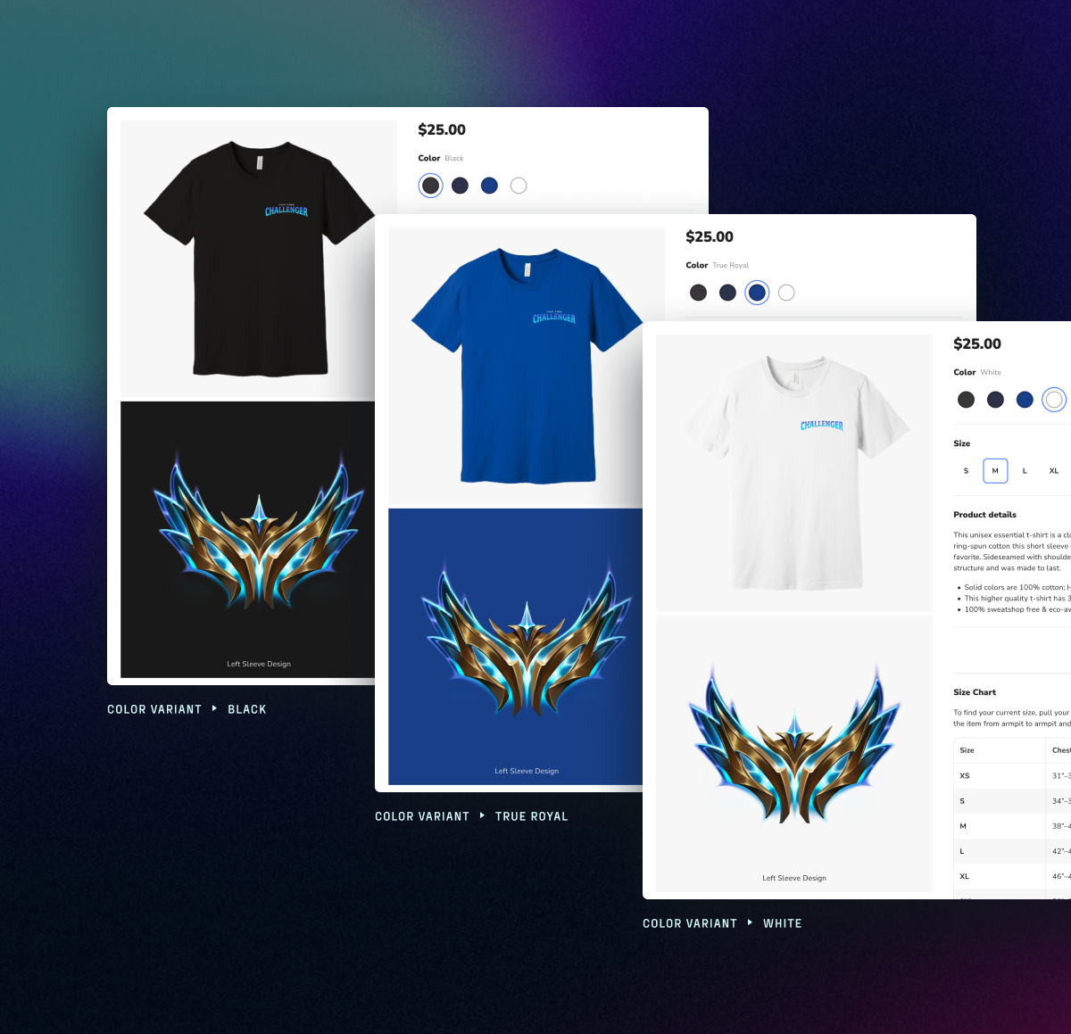
I improved the first step of the merch creation process. The product selector was cleaned up by consolidating multiple listings of a single product (by print side) into a single list item. This helps creators find their product quicker and into the design.
I grouped the print sides with the enabled color variants. With this grouping, creators can now easily find all of the product view/mode controls in the same area.
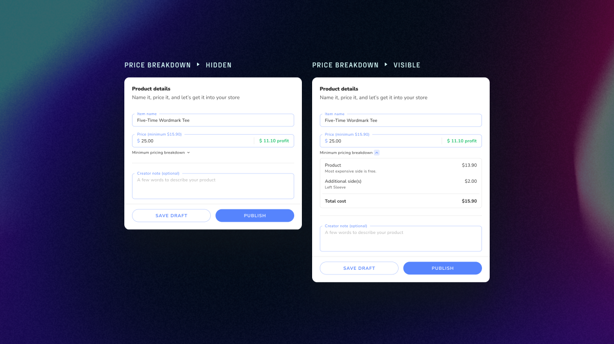
The dropdown component keeps the current print side view visible. The popup menu reveals more information: (1) all available print sides, (2) additional pricing, and (3) an indication if a design was added to a print side.
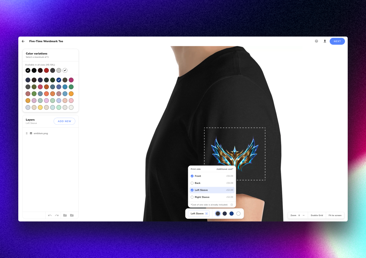

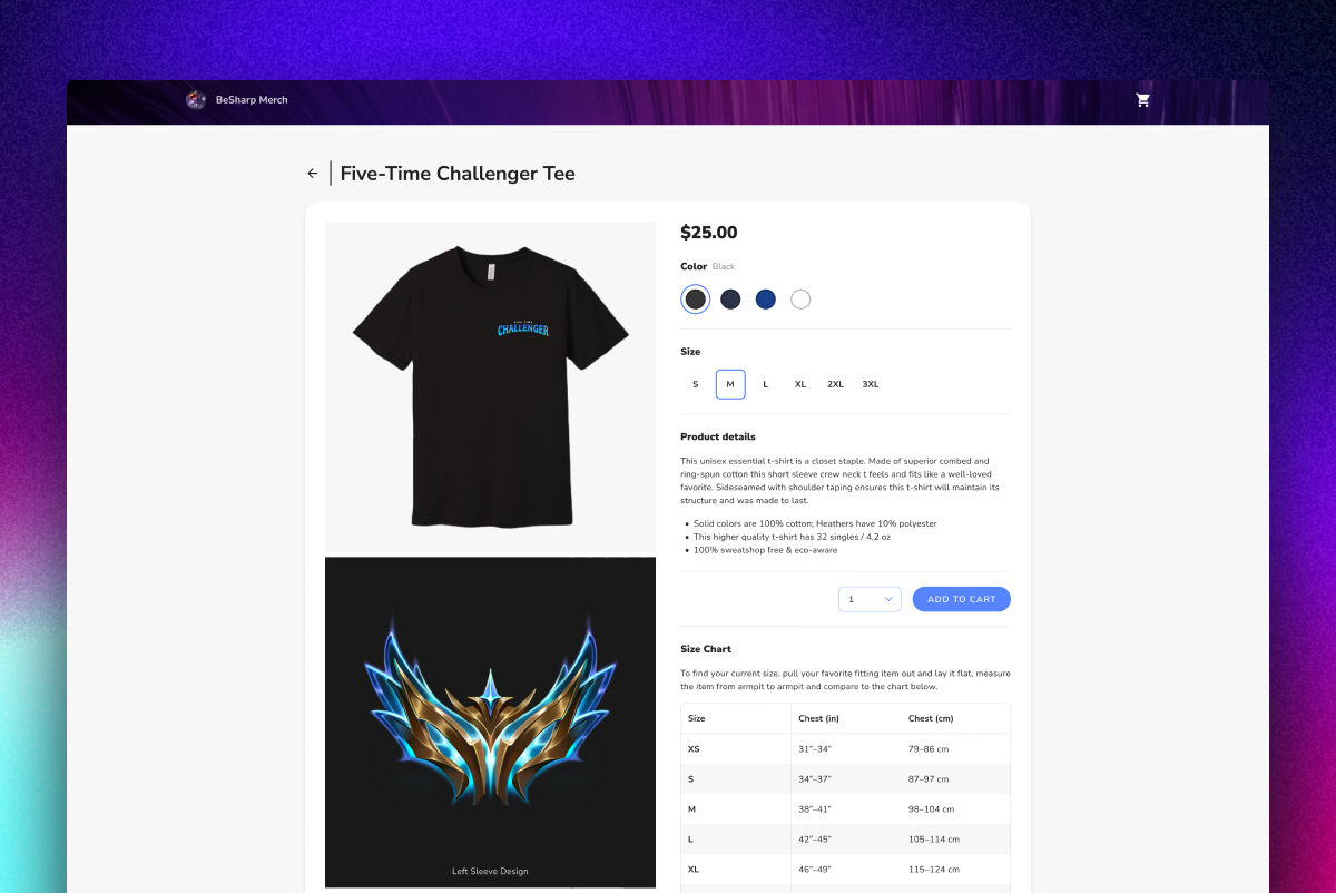
I also updated the product detail page to include the different views for any merch with multiple sides.
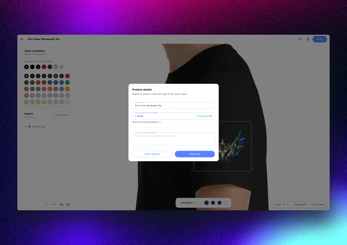
However, we ran into a challenge with the API from our third-party vendor for fulfillments. While merch images for the front and back sides rendered as "flat lays", our third-party vendor only provided "on model" renders for side sleeves.
A quick workaround solution was to show the design itself with a label underneath it indicating the print side. To make it dynamic, the background color changes based on the viewer's selected color variant.
We received positive feedback from creators who were excited for this launch.
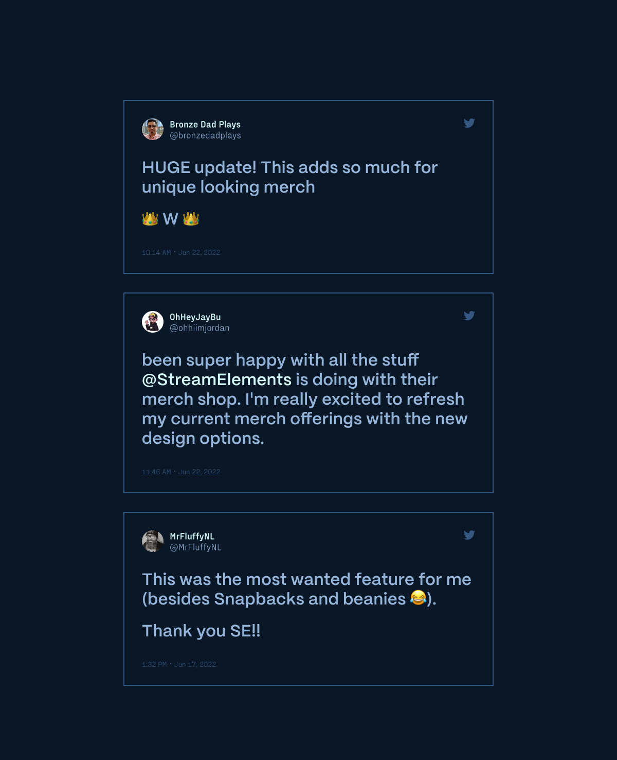
We were also happy to see business metrics uptick. From our research earlier in the process, we knew that creators were switching to our direct competitors. With this launch, reactivated stores increased. While this design could be refined for future launches, it was rewarding to see the early signal we got from our creators and the value that we quickly delivered to them.